The shelves in my entryway are probably my favorite thing in my entire apartment. I initially wanted a simple white ladder-style. I’m so glad I opted for this glass and chrome style instead. But open storage is hard. Making it both functional (because for me these need to work as an entryway landing site and storage, not just decor) and beautiful isn’t easy. Closed storage would have been so much simpler, but I wanted the open feel of shelves.
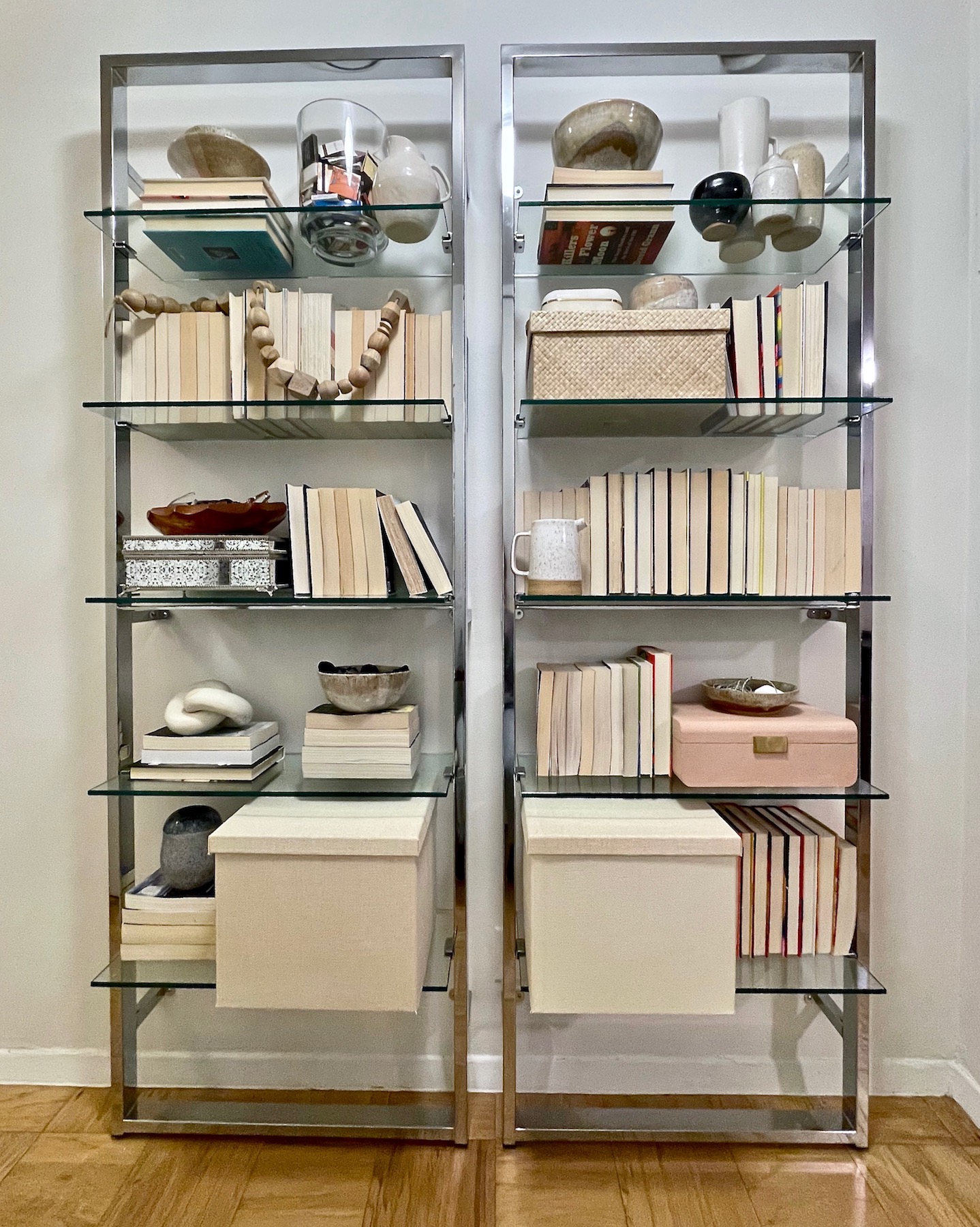
I know there is a lot of controversy around spine-in books. I get it. I actually prefer spine out books too. But, I love to read and not all of my books are pretty coffee-table style. And I don’t love how chaotic they look. Books are colorful, and holy cow, do I love the look of bookshelves filled up with books. But, my shelves need to serve as more than just book storage and over the years I’ve purged and given away a lot of my books (I also utilize one of our greatest resources….the public library), so, not only am I currently not in possession of the hundreds of books needed to achieve the look, but that style is simply not practical for my purposes.
After moving in, I filled up the shelves, but quickly turned all my books spine-in for aesthetics, and I’ve kept the shelves basically untouched since I installed them about six months ago.

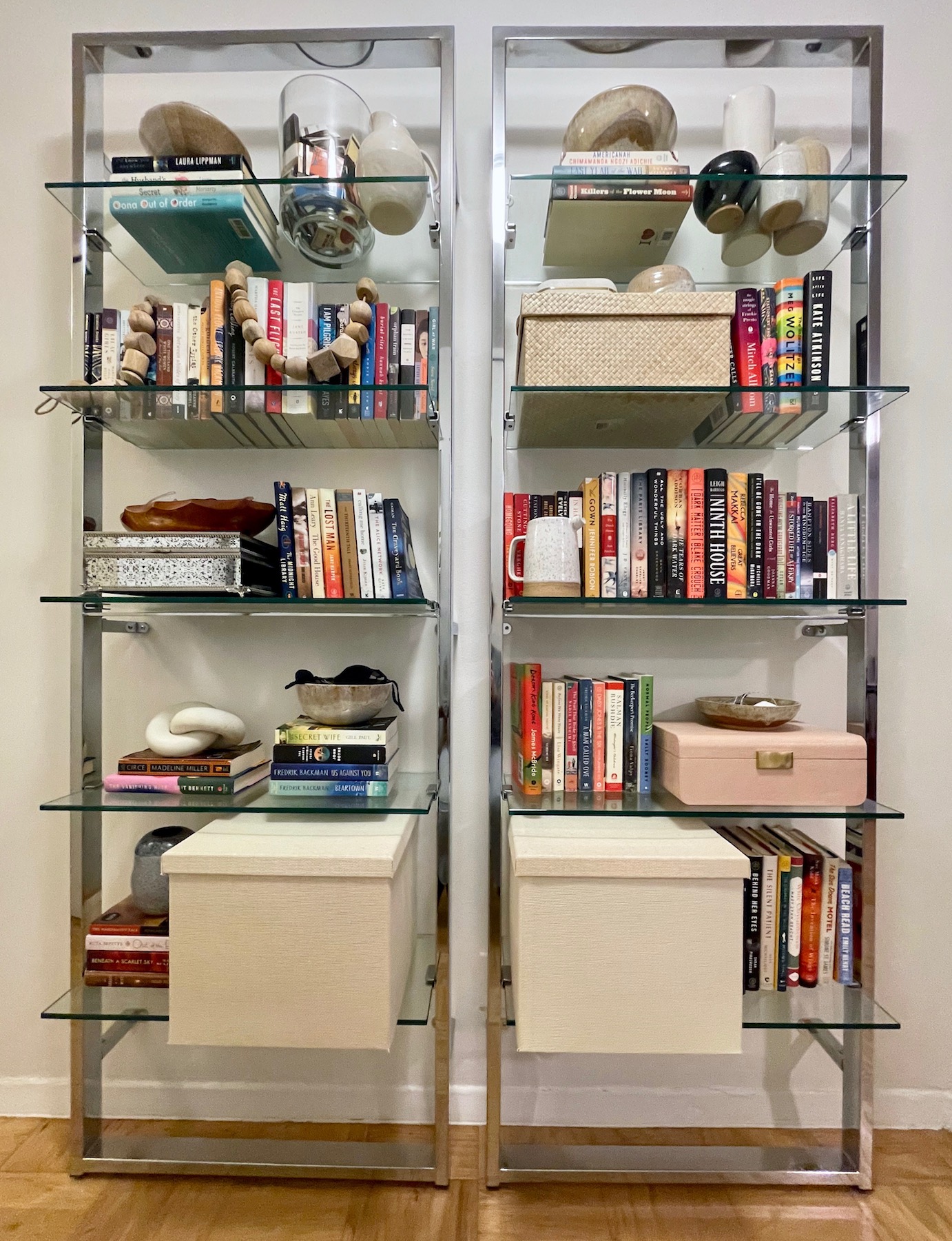
I like how calm the muted tones of the backwards books look, but I didn’t want to give up on the idea of spine-out books either. Just as a starting point, I simply turned all the books spine-out. And for me, this just seems too noisy.

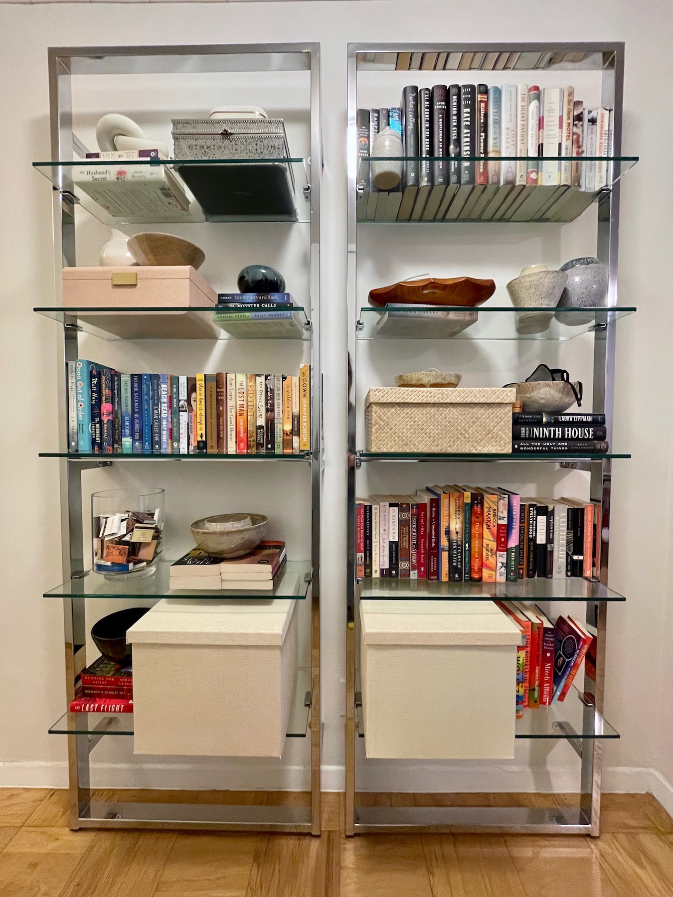
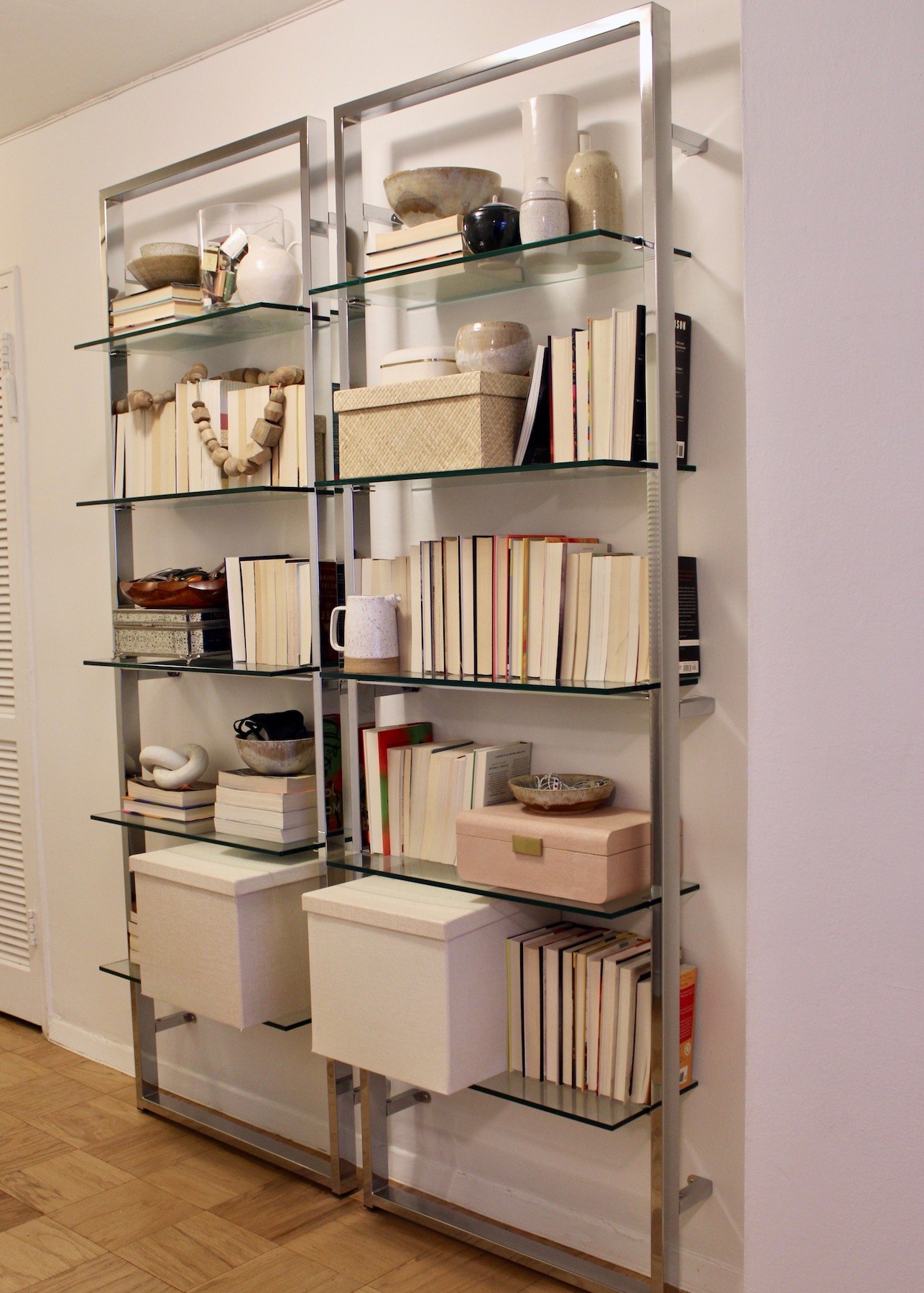
I wanted to see if I could put together an arrangement with what I currently have (no shopping for more decorative objects and no moving the books with brighter-spines to a different spot) that doesn’t scream chaos. And I think I may have gotten there. I’m loath to say that while I didn’t actually use color-blocking, I did have to do a semblance of color organization with the books to make the shelves look cohesive. Color-blocking like spine-in books is very controversial and I didn’t want to swap one questionable shelf styling trend for another. I’ve seen it done beautifully and if you love it, great!

To achieve a non-crazy looking version of the shelves, I did have to follow a formula. I found I needed to do a couple of shelves exclusively books and then sprinkle a few throughout for height and interest. It’s also very important to have some larger pieces to fill up the shelves, mine are mainly in the form of boxes, which also serve as much needed storage. That’s right, things like tape, sandpaper, glue, craft paint, ribbon, etc. are all crammed into all the pretty vessels that occupy the space. I also peppered in some pottery and other decorative objects to give the shelves interest and texture.
Do I think there is a strong possibility I revert to the previous version? Yes. But, I also think I succeeded in finding a pleasing arrangement using some non-aesthetically pleasing books. (I think it could be made even better if a removed a few of the book-jackets, but that’s not something I’m on board with).
P.S.: Because it wouldn’t be a post by me if I didn’t mention the quality (or lack of quality) of my photos, I was unable to take straight-on full length photos of the shelves using my camera, so everything you see here is an iPhone special.
